Trendy colors for walls in 2024: how to choose?
In the world of interior design, wall color ideas play a key role, affecting not only the appearance of a room but also the mood of its inhabitants. Each year, new shades are added, offering fresh ideas for those looking to revitalize their home with new colors. Here, we will examine the current color trends, answer the question of how to choose a wall color, and help make your interior modern and stylish, while maintaining coziness and comfort.
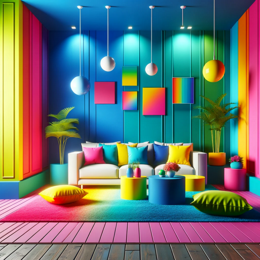
Top 5 colors that dominate this season's interiors
In 2024, the interior color palette is enriched with deep and rich variants that bring coziness and individuality into homes. Popular wall colors offer a multitude of options, for example, Very Peri, which plays on the edge of blue and purple, Cobalt, which adds dynamism to the interior with its brightness and depth. There is also a shade called Mushroom. It introduces elements of calmness and natural harmony. Color Blocking offers a bold combination of colors, creating bright and memorable accents. Finally, terracotta with its earthy tones emphasizes warmth and coziness. These shades become the basis for creating a modern and stylish interior. Next, we will talk more about each option, show modern repair works with these colors, and describe their features.
Very Peri
The shade Very Peri has been declared the main color of the year by the Pantone Institute. It represents a unique combination of deep blue and red-violet tones. Wall paint ideas with this shade symbolize vitality and energy, reflecting the spirit of the modern era. Deciding to paint walls in Very Peri may seem risky, but the result justifies the boldness, and here's why:
- The shade creates a deep and rich background for furniture and decor.
- It brings incredible energy into space.
- Very Peri enriches the space, adding a unique touch and a multi-layered perception.
Choosing Very Peri for the walls of your home will transform the interior into a source of inspiration and visual pleasure, filling every room with a sense of uniqueness and creative potential.
Cobalt
Cobalt is among the fashionable wall paint colors. With its deep and bright blue shade, it brings expressiveness and dynamism to the interior. Cobalt can improve concentration and promote relaxation, but when using it, it's important to carefully select matching decor and lighting to avoid a sense of oversaturation. It harmonizes well with white and brown, creating a calm and balanced atmosphere. Combining it with yellow, red, and orange adds radiance to the interior, which can be balanced with neutral beige tones. Furniture in the Cobalt shade, such as a soft chair with textile upholstery, becomes a bright accent in a monochromatic interior, attracting maximum attention and making the space stylish and unique.
Mushroom
The Mushroom shade embodies neutrality, creating a sense of calm and harmony. It is ideal for the bedroom paint colors. Its ease of combination with colors such as yellow, brown, green, pink, and grey opens up endless possibilities for design. Mushroom does not capture all the attention, allowing the focus to be on bright furniture and decor without the risk of oversaturating the interior, ensuring a cozy and comfortable space.
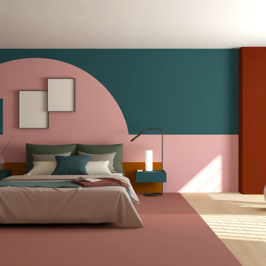
Color Blocking
Wall color in the style of Color Blocking is a technique that has migrated from the world of fashion, playing on the contrast of shades to create a dynamic and vibrant space. This method combines several shades that interact with each other, creating unique and bold compositions. The main features of this style include:
- it brings liveliness and energy into the space;
- the style allows for experimentation with contrasting shades;
- the colors in such a room interact with the furniture and accessories, creating a harmonious interior.
Applying Color Blocking in the interior requires balance and a sense of style, but the end result can transform any space, making it more expressive and memorable.
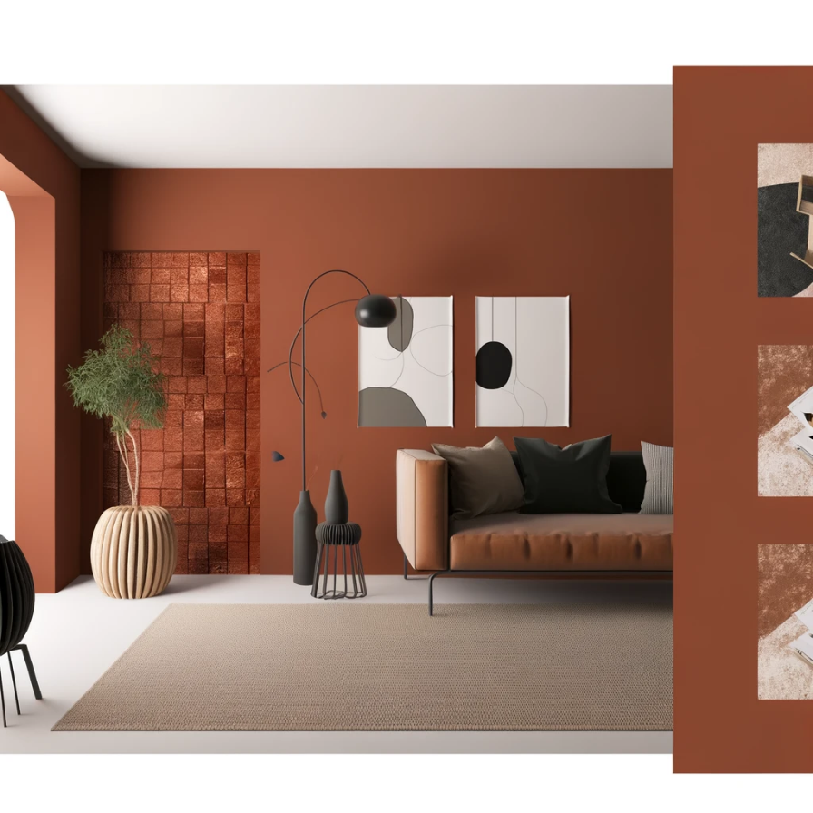
Terracotta
Also popular for wall paint is the terracotta shade, which combines the warmth of brown, orange, and red tones. It creates a sense of coziness and home warmth. The shade is reminiscent of Eastern spices and autumn leaves, bringing a sense of tranquility and solitude into the interior. Thanks to its versatility, the terracotta option easily adapts to various color palettes, making it an excellent choice for both wall finishes and furniture color schemes.
Which colors are versatile / win-win?
As we've already understood, there are many different color options and styles used to create a modern and stylish interior. But what wall paint ideas will always be relevant? Everyone wants to know the answer to this important question, so now we will try to give a clear and understandable answer.
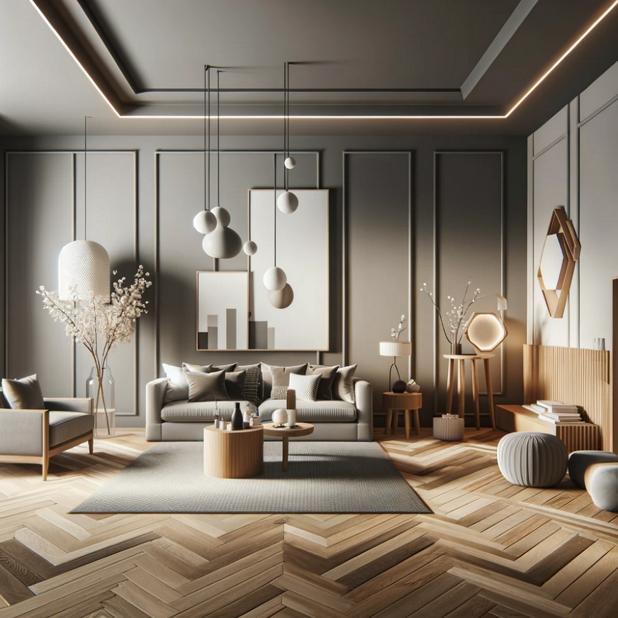
A fail-safe option for the interior is a monochrome scheme. It allows for playing with different shades and textures within one palette. This creates harmony and unites the space, making it suitable for any room. For example, a combination of gray shades with warm wooden elements creates a design with a good balance of warm and cold tones. Cool beige and warm gray are versatile options, and white wall color adds flexibility in decorating with the possibility of introducing bright accents through furniture and textiles.
If you're still having difficulty deciding on the best option, you always have the opportunity to consult with experts from the RSU company and order a designer renovation, in which we will consider any requirements and wishes.
How do the colors of your rooms affect your mood?
The wall colors in our homes play an important role in shaping the mood and emotional state. Light tones stimulate activity and enhance mood, making the space more open and airy. Whereas dark shades can evoke a sense of coziness and concentration, but if used incorrectly, they can create a feeling of oppression. The right choice of color contributes to harmony in the home and positively affects the psychological state of its inhabitants. Therefore, you can make a quality repair due to the RSU company. Our company's specialists will select the best shades for each room and create the perfect atmosphere in the home.
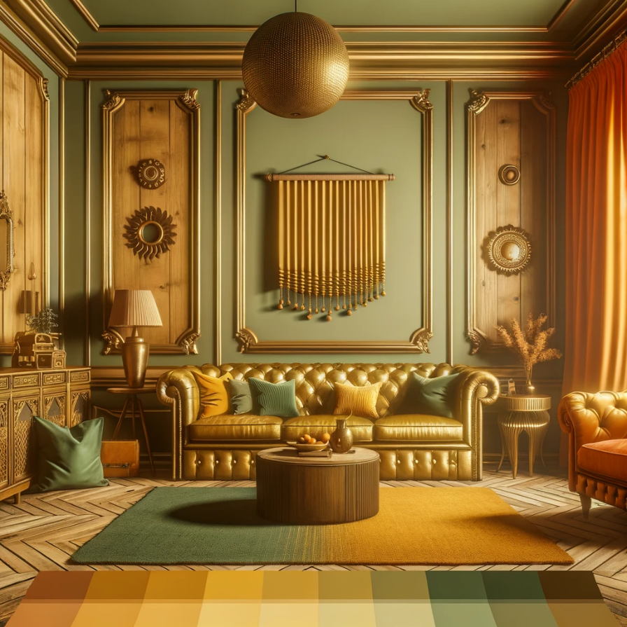
Colors that are anti-trend
In current design trends, those once fashionable wall paint colors that do not contribute to creating a harmonious and cozy space are becoming a thing of the past. Here are a few examples of such shades:
- Too bright and saturated options, which can tire the eyes and create a sense of discomfort.
- Shades that are too contrasting and do not harmonize with the overall style of the room, leading to a perception imbalance.
- Colors associated with outdated trends. For example, certain shades of gold or bronze, which without proper context can look out of date.
Instead, the focus is on more versatile and durable wall color ideas, about which we talked. These shades allow creating a space that will remain trendy regardless of changes in interior design fashion.
How to choose wall colors for different rooms?
Choosing the shade of walls for different rooms in a house or apartment is not just a matter of aesthetics but also functionality. Each room has its purpose, and the wall colors can significantly affect mood, comfort, and even productivity. For example, calm, relaxing shades are preferable for a bedroom, facilitating rest and sleep, while more saturated colors may be suitable for a study or home office, stimulating activity and concentration. It is important to consider both personal preferences and the characteristics of each room, including its size, lighting, and purpose, to create a harmonious and comfortable space. So, how do you choose the wall color for each room? We will try to answer this question next.
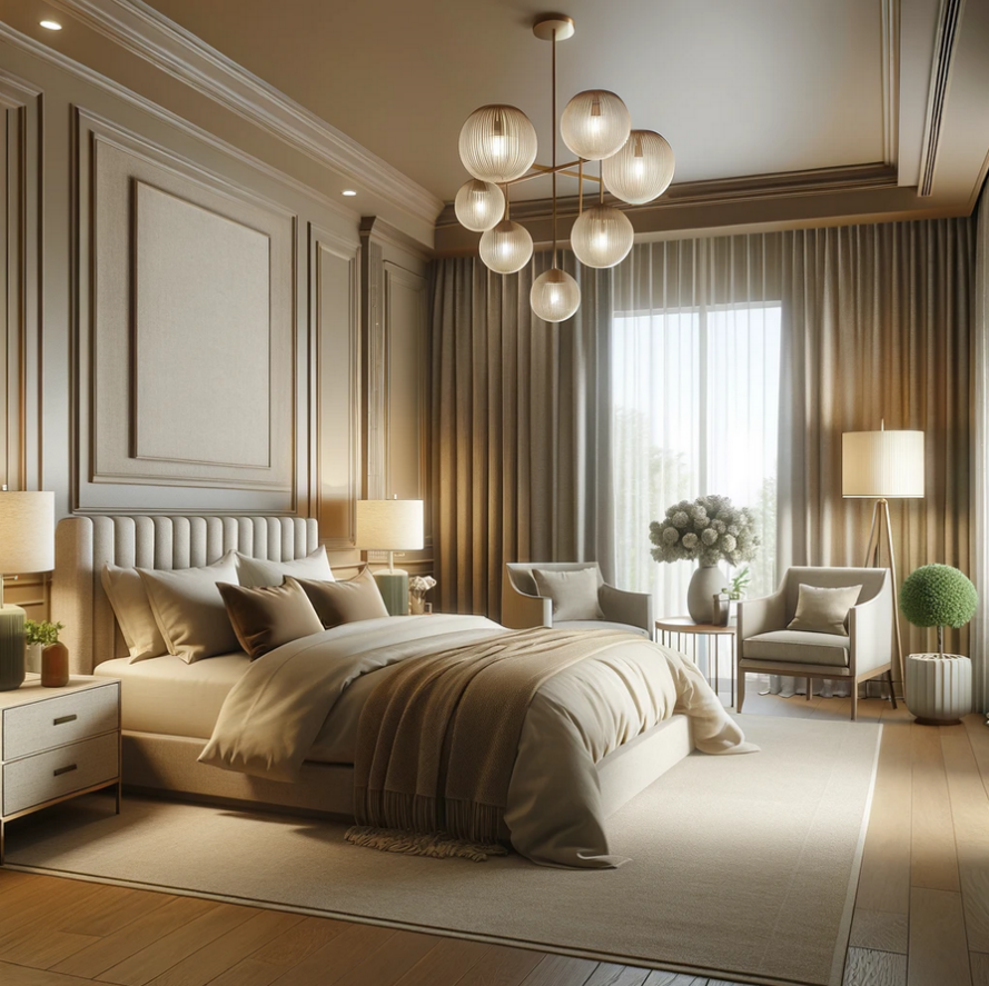
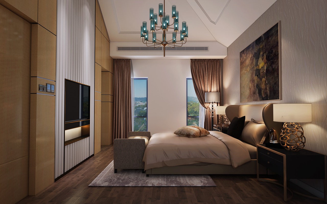
How to choose a wall color for a bedroom
When choosing bedroom paint colors, it's important to focus on creating an atmosphere of peace and restoration. Soft, muted shades such as blue, sand, beige, and green are ideal for this room, filling the space with tranquility and harmony. Soft green, in particular, is especially good as it is versatile and appealing to both men and women, promoting relaxation and serenity.
How to choose a wall color for the kitchen
In the kitchen-dining area, it's recommended to avoid too dark shades, so the space doesn't feel oppressive and enclosed. Light and bright options can make the kitchen feel more spacious and visually enlarge it. However, the most important factor is your personal preferences and how colors affect your mood and perception of the space. When choosing fashionable wall color ideas in the kitchen, it's important to consider the interior style and the overall color palette of the home to create a harmonious and pleasant space for cooking and dining. You can realize your individual design with the services of the RSU company. We are ready to transform your kitchen qualitatively and reliably and help in choosing the best shade for any room.
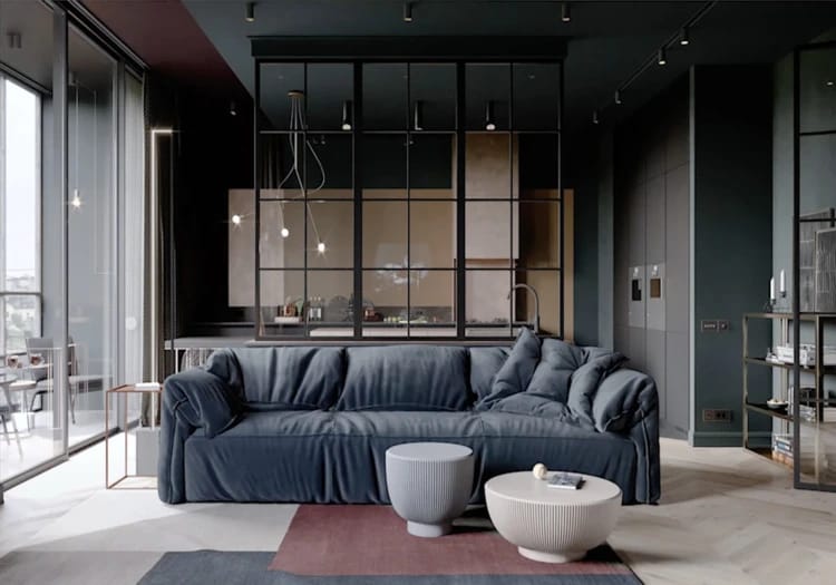
How to choose a wall color for the living room
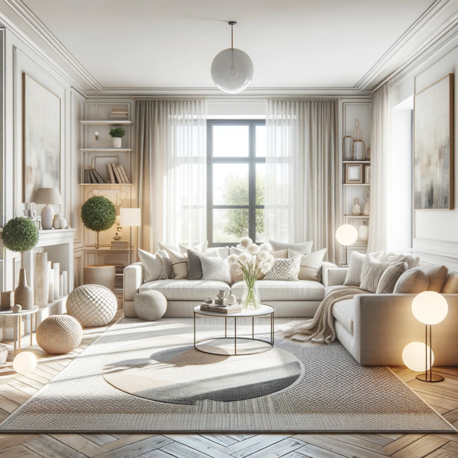
In choosing a shade for the living room, the main criterion should be creating a cozy atmosphere conducive to relaxation and communication for the entire family. The living room is the heart of the home, where everyone should feel calm and comfortable, returning here for a charge of positive energy after a hard day's work. Designers recommend preferring soothing and warm shades, such as white, gray, or beige, which not only create a sense of space and light but also easily combine with other colors and interior elements, allowing the space to be easily adapted to any family preferences and needs.
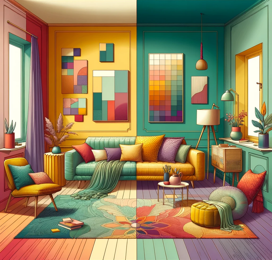
Combining two or more colors: is it worth doing?
Combining colors on the walls can be an excellent solution for creating a unique and harmonious space. It not only adds dynamics and depth to the design but also facilitates zoning of the space, visually dividing it into functional areas. With the right choice of colors, such a combination can improve the perception of the interior, making it more interesting and aesthetically appealing. It's important to remember about balance, choosing colors that complement each other and match the overall style of decoration. Thus, combining colors on the walls is not only possible but also desirable for creating a personalized and complete image of your home.
Top 3 successful wall color combinations for your home
Popular wall paint colors vary. Choosing the right combination can work wonders, transforming each room into a pleasant and comfortable space. The correct color palette in the interior contributes to creating various atmospheres — from tranquility and coziness to energy and inspiration.
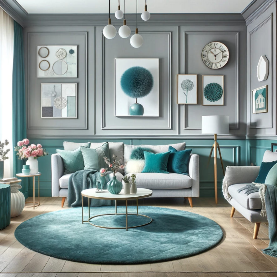
- Gray and turquoise. Perfect for the living room, where soft gray serves as the base, and bright turquoise accents add liveliness and dynamism.
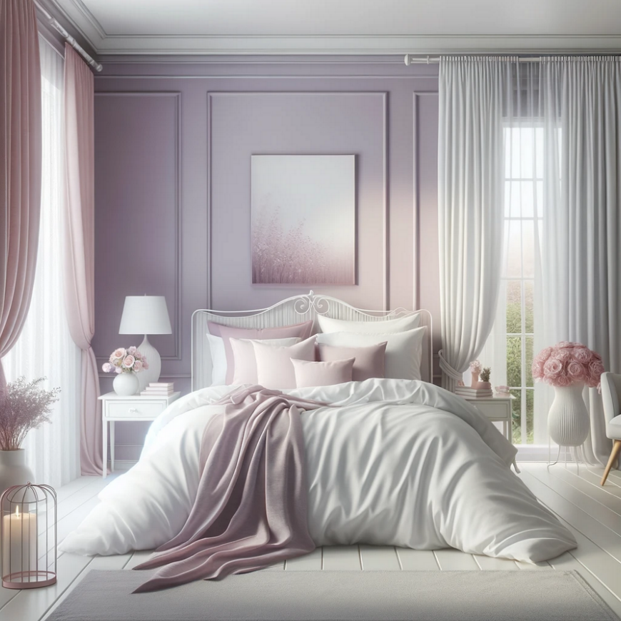
- Lavender and white with pink accents. A wonderful choice for the bedroom paint colors, creating a sense of calm and romanticism.
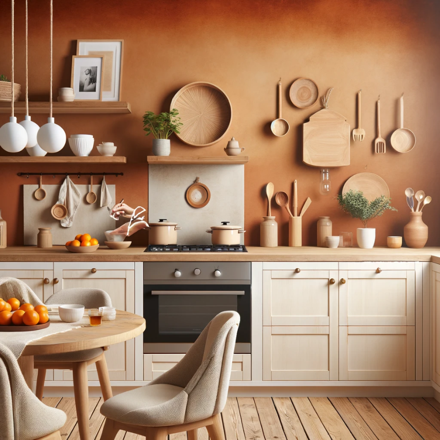
- Terracotta with cream and natural wood. A warm and cozy option for the kitchen, where terracotta walls are combined with cream cabinets and elements of natural wood.
Such combinations not only give the interior uniqueness and style but also create a comfortable space for living and relaxation. They demonstrate how the combination of colors on the walls and decor can affect the overall perception of the room, making it more attractive and functional.
Common mistakes when choosing a wall color
Color of wall is a key element in interior design, but there are several common mistakes that can negatively impact the final result. These mistakes can not only spoil the appearance of rooms but also affect the mood and well-being of the occupants:
- Buying paint without testing shades. Bright shades might look appealing on a sample, but in an interior, they create a sense of discomfort.
- Choosing pure white paint. Snow-white walls can make the space too "sterile" and cold without the addition of warm tones.
- Preferring bright colors. Very bright colors can be "harsh on the eyes," creating an unpleasant sensation.
- Following trends rather than personal preferences. It's important to choose options that you like, not those that are currently popular.
- Ignoring the functionality of the space. It's necessary to consider how the color will interact with the room's tasks.
We understand how important it is to avoid these mistakes when choosing a color palette for your home. Our specialists will help select the perfect shades that will not only be pleasing to the eye but also match your personal preferences and the functional requirements of each room, creating the perfect space for living and relaxation. If you want to ensure our competence and the quality of our services, you can look at customer experience after the renovations we've conducted.
Summary
The right color palette in the interior can significantly affect the atmosphere and perception of the space. This decision should take into account both aesthetic preferences and the functional aspects of each room. Here are the final recommendations from the experts of our company:
- Light can drastically change the perception of color, so always test the chosen shades at different times of the day.
- Choose wall paint ideas that complement each other and the overall palette of your home.
- Using accent walls or combining several colors can add dynamics to the interior.
- Choose colors that match the functions of each room – calm shades for the bedroom, stimulating ones for the workspace.
Specialists and designers of our company are always ready to offer professional help and consultations to make your home a reflection of your individuality.


