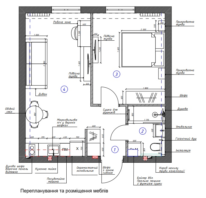
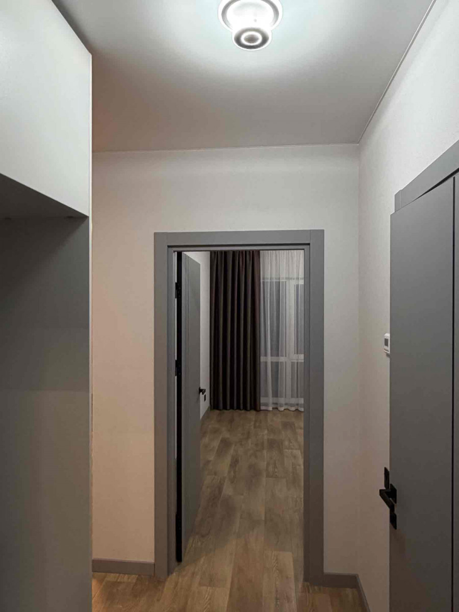
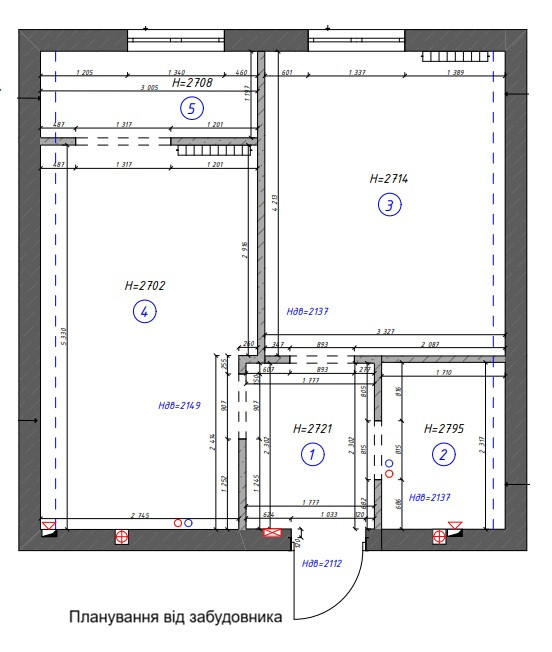
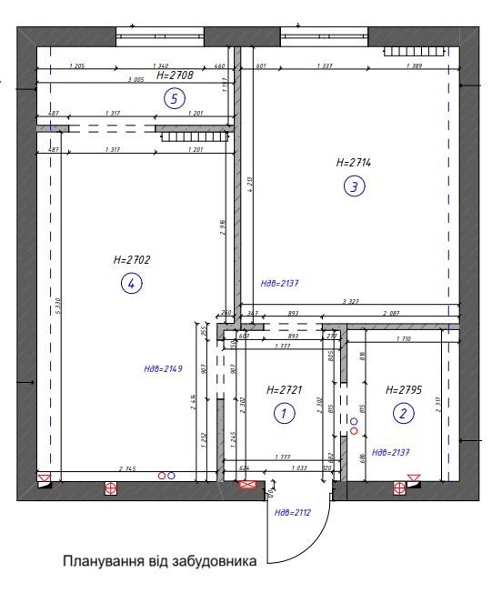
This project is about how even a small apartment can be transformed beyond recognition when approached not formally, but with an understanding of real-life living. At the start, we had a standard layout with clearly felt limitations: a narrow corridor, scattered zones, no proper workspace, and a constant lack of storage solutions. The space was neutral but lacked character and didn’t support daily routines — everything existed on its own, without connection between areas.
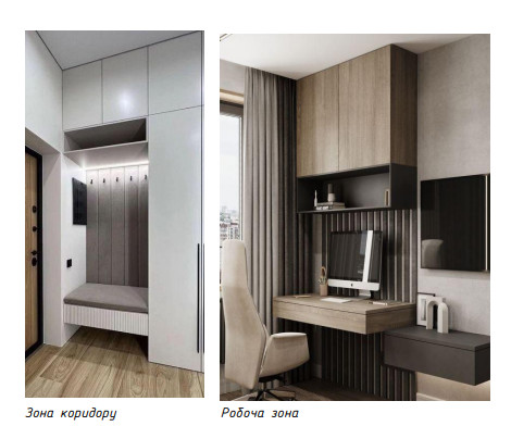
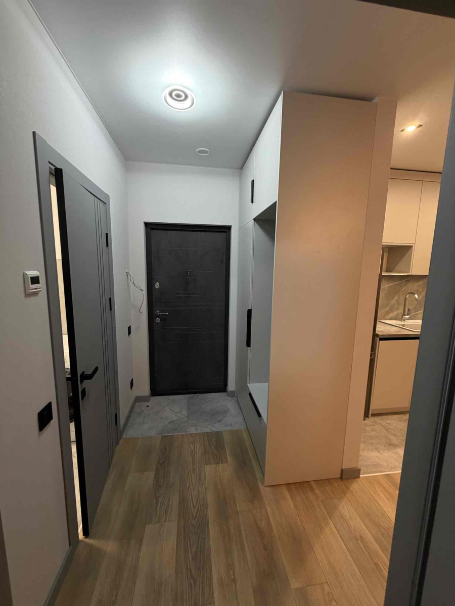
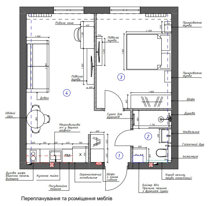
The main goal was not just to “modernize” the interior, but to make it logical, comfortable, and functional for the residents. That’s why work began with a careful reconfiguration. The changes were subtle but very precise. The corridor stopped being just a transit area and became a fully functional space. Built-in wardrobes, a seating area, and hidden storage were added, allowing the apartment to “work” from the very first steps inside.
At the same time, the zoning was thoughtfully reconsidered. The space now has a clear structure: a separate work area was created, which doesn’t feel temporary but integrates organically into the interior. It was designed to be comfortable for daily work — with proper proportions, lighting, and storage — while still fitting seamlessly with the overall style of the apartment. The living area became more open and calm, without feeling cluttered.
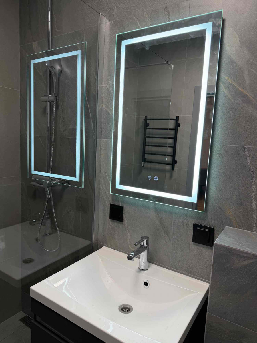
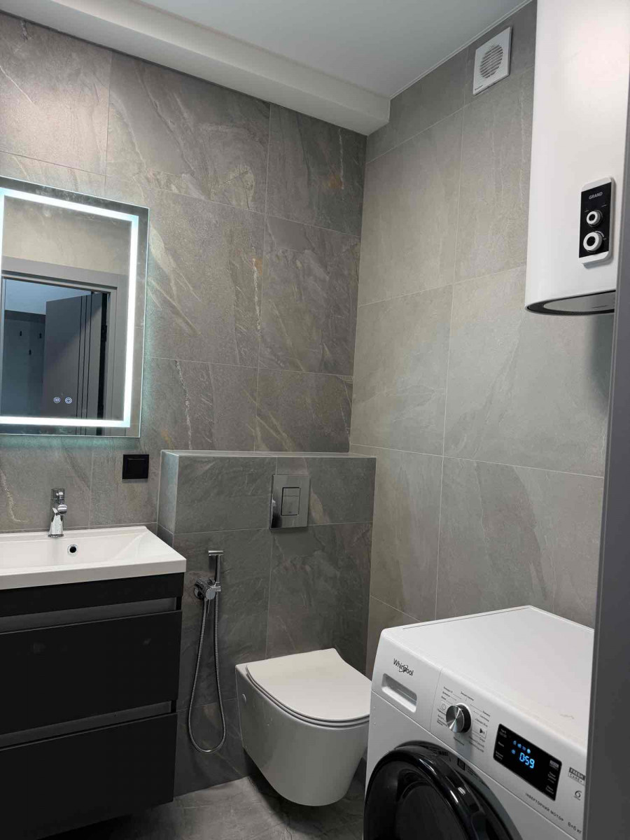
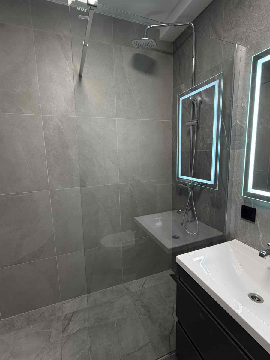
Special attention was given to the bathroom. The space was optimized to include all necessary functions, including a washer-dryer, extra niches, and convenient usage scenarios. As a result, even the technical area looks thoughtful and aesthetic, rather than a compromise.
Stylistically, the apartment is designed in modern minimalism with elements of soft modern. It’s an interior without excessive decor or loud accents, where proportions, textures, and light play the leading role. This approach allows the space to remain timeless and not tiring in everyday life.
The color palette was deliberately chosen to be calm and warm. The combination of natural wood with deep graphite and dark gray tones creates a sense of tranquility, stability, and coziness. Light neutral walls balance the darker elements, visually expand the space, and fill it with air. This palette doesn’t shout or impose itself, allowing the interior to “live” together with its owners.
Textures were another tool in shaping the space. Vertical wooden slats add rhythm and visually emphasize ceiling height, matte surfaces reduce unnecessary shine, and the overall restrained use of materials creates a sense of cohesion and calm. The apartment looks high-end not because of showy elements, but thanks to thoughtful details.
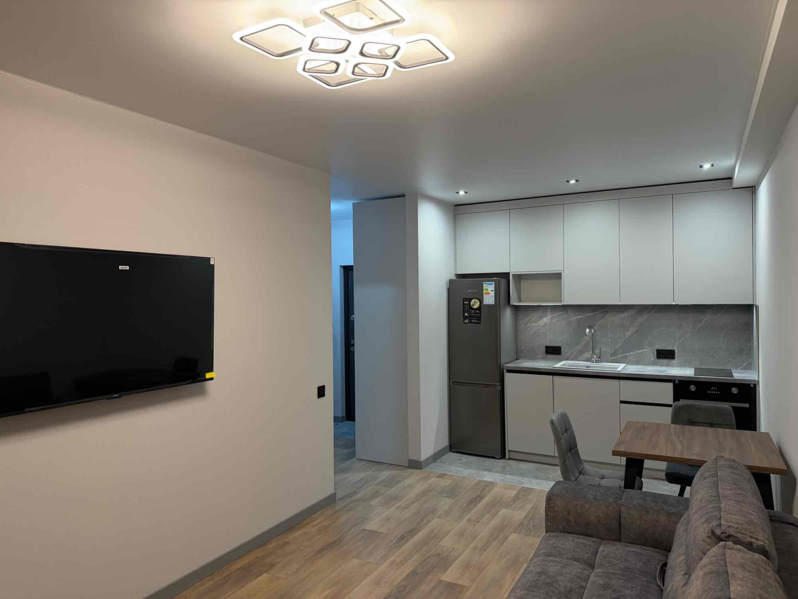
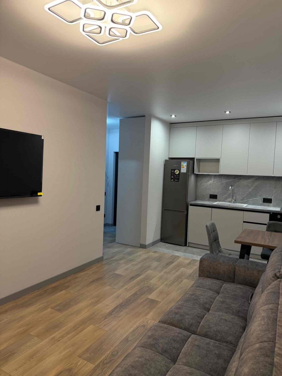
Lighting was designed on a multi-level principle. General lighting provides comfort, task lighting ensures functionality, and accent lighting creates atmosphere in the evening. The light does not dominate but gently highlights architecture and materials, helping the space change mood throughout the day.
In the end, this apartment has transformed from a simple, neutral space into a carefully considered living environment. There are no random decisions — every square meter has a purpose, and each zone is logically integrated into the overall composition. This is an interior not just “for pictures,” but for real life, work, relaxation, and daily comfort.
Before — just an apartment.
Now — a cohesive, calm, and functional space that supports its owner every day.
